


Each month we ask clients to spend a few minutes reading through our newsletter with the goal of raising their investor IQ. Heading into the back half of summer, we are focusing August’s Timely Topics on a continued conversation around market breadth, misconceptions around stock splits, and the macro-economy.
- Market breadth
- Stock splits
- Deficit spending
- What is recent employment data signaling?
- NSAG News
- Where will the stock market go next?
Market breadth
Last month, we featured two articles, Beware of a Narrow Market and Market cap weighting versus equal weighting.
In the first, we examined the risks involved in passively investing in markets and indices that are very concentrated and top-heavy, as the historical precedence has not favored this strategy. Bearing this in mind, we expand upon a market breadth analysis. In the latter, we evaluate the importance of active management post periods of extreme market narrowness and concentration. In measuring the returns of each index since 6/30/1990 (the inception of the equal weighted S&P 500), the equal-weighted version has outperformed the market cap weighted version of the index by ~0.8% per year on an annualized basis.
Bearing this in mind, In June 2024, 36% of the S&P 500 was made up by its top 10 holdings. In our view and knowing our market history, this raised a red flag. Since July 10, we’ve seen a breadth surge in the U.S. markets. The term “breadth” simply refers to the level of participation in market rallies (Increased breadth = increased number of stocks with positive returns relative to negative returns). Since July 10, we’ve seen investors rotate out of the top 10 names within the S&P 500 and other mega-cap technology names in favor of other likely underpriced areas of the market (small cap, mid cap, and large cap value stocks). Over this time period, the index itself is down 1.9% in aggregate, despite the fact that ~70% of the 504 stocks in the index have had positive returns. How could this be possible? Because the index has become so reliant on the top names in the index (representing 36% of the index), the 77% of stocks with positive returns have not had a meaningful impact in aggregate (see table below).
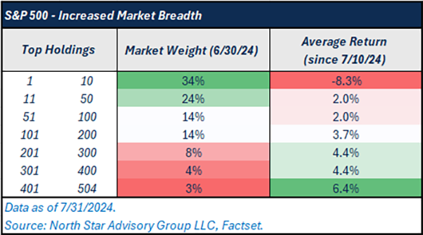
On average, holdings 11-504 (ranked by index weighting) have all had positive returns, and the positive returns get greater as you keep moving down towards the bottom of the index. Although, the top 10 names have been down ~8% on average completely wiping out the impact of increased breadth on a market-cap weighted index like the S&P 500. This is why we’ve been recommending that clients maintain a well-diversified portfolio of equities.
We noted that the last prior period where there were historical levels of concentration within the S&P 500 was 1999/2000 during the tech bubble. Of course, while today’s market does have some similarities to this period, there are also many differences. Regardless, in March 2000, 28% of the S&P 500 was made up of the top 10 holdings. Over the next six years, the S&P 500 Market Cap Weighted Index underperformed; small cap, international developed, emerging markets, and the equal-weighted version of the S&P 500. Indicating that broad market rallies tend to follow periods of market narrowness.
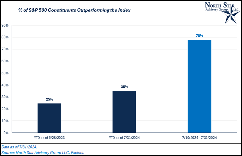
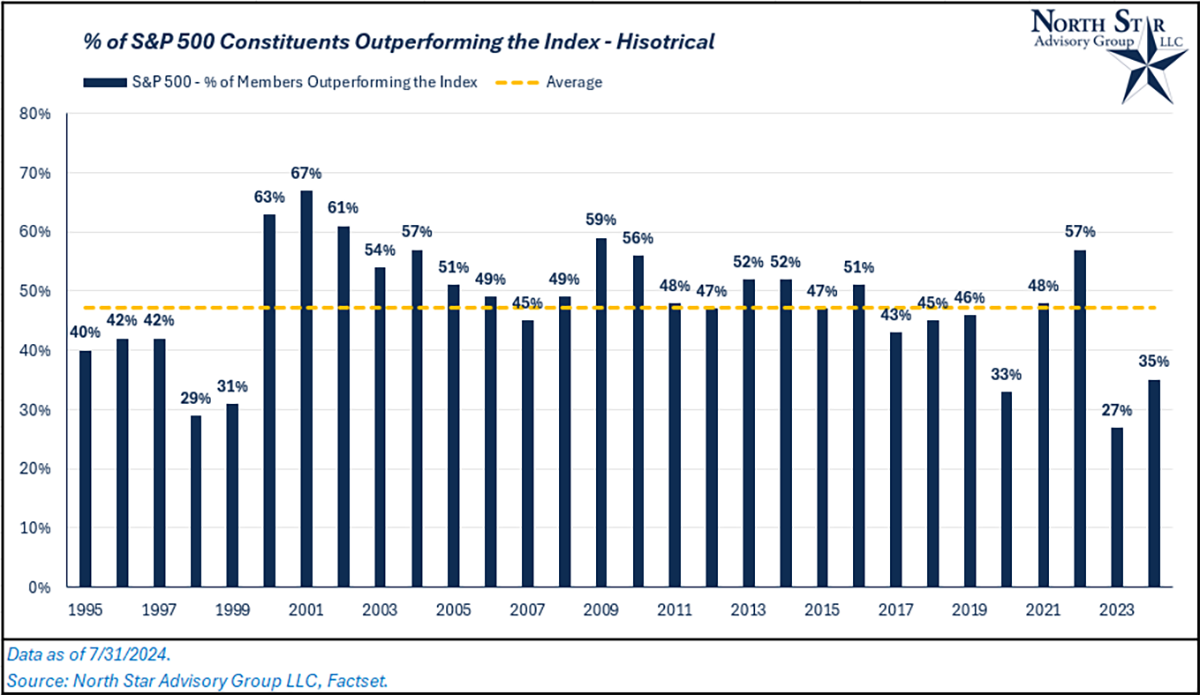
The bigger question: can this trend of increased breadth continue? The increase in breadth can be viewed as the % of index constituents outperforming the index itself. Since July 10, this number is 78%. But still, on a year-to-date (YTD) basis, the number remains low (35%), indicating a narrow market. Historically, there is plenty of room for more increased breadth as this number has been ~47% on an average annual basis over the past 30 years (see both charts below).
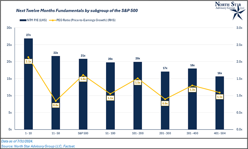
What will be the catalyst for a continued broadening of the market? When we think about the two primary drivers of stock returns (valuation and earnings growth) the risk/reward profile of stocks 11-504 are generally more favorable than the top 10 names. To measure this, we used the PEG or price-to-earnings growth ratio, which takes a stock’s P/E multiple divided by its estimated earnings growth over the next twelve months (NTM). For context, a lower PEG ratio is considered more favorable.
Stock splits
We’ve recently received an influx of client requests and interest in investing prior to stock splits. There is a common misconception in the markets that stock splits add value.
Economically, stock splits (or reverse stock splits) have no impact on shareholder value. Hypothetically, if you own 100 shares of a stock that is priced at $100/share, the value of your holding is $10,000. If you were to hold this hypothetical stock through a 5-to-1 stock split, you would now own 500 shares at $20/share. While the components of your holding value equation have changed, the outcome remains the same. 500 shares x $20/share = $10,000.
Stock splits and reverse stock splits do not make any material changes to a stock’s valuation or financial statements either. For example, if that same hypothetical stock has earnings per share of $5 before the split, its price-to-earnings ratio would be 20x ($100/$5). After the split, the stock would have earnings per share of $1, as the share count has increased by 5x ($5/5). Still, the price-to-earnings ratio for the stock is 20x ($20/$1).
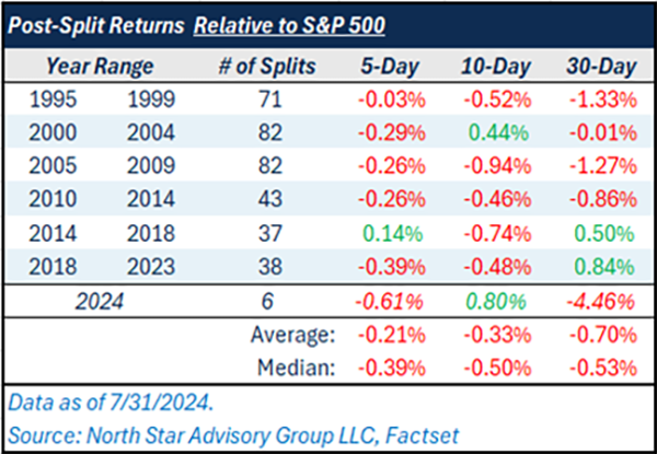
For investors, the biggest common misconception is not that stock splits change the economic value of a stock, the misconception is that a lower price will lead to investment gains due to increased volume and investment in that stock. To test this, we looked at a dataset of 366 large cap stocks in the S&P 500 who’ve had a stock split at some point in the past 30 years. Post split, did any of these stocks experience outsized gains relative to their benchmark (S&P 500)?
On average, excess returns versus the benchmark 5-, 10-, and 30-days after a stock split were negative (see table below).
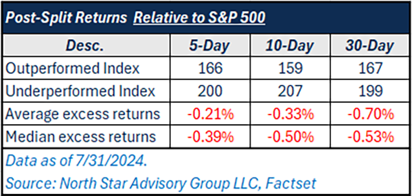
Since this table includes historical data that dates back to 1995, let’s separate the timeframes. Increased use of algorithmic trading, high-frequency-trading, and momentum trading in recent years may change this picture.
Looking at each time frame, the majority of excess returns are still negative, even in a more recent period from 2018 – 2023 and 2024. This doesn’t mean you can’t buy stocks prior to a split; it just tells us that the split itself should not be the major investment thesis for buying a stock.
Defecit spending
In this upcoming election cycle, both sides of the aisle will eventually begin to feel pressure to lower the deficit by either increasing revenues or curtailing spending.
In 2023, the U.S. Federal Government ran a budget deficit that was 6.5% of nominal GDP (gross domestic product). While the U.S. has historically been deficit spending nation, it needs to be done on a sustainable path and at times when the economy needs stimulation (increasing deficit during times of economic crisis). Conversely, when the economy is growing at a fast rate and unemployment is low, the U.S. should generally be spending less (shrinking the deficit during times of economic prosperity).
To display this concept, we’ve charted annual unemployment rates versus annual budget deficits. In general, sustainable budget deficits have fallen somewhat tight to the chart’s trendline within the green oval. In recent years, and in 2023 in particular, the U.S. has had very low or declining unemployment with higher deficits than what should reasonably be expected.
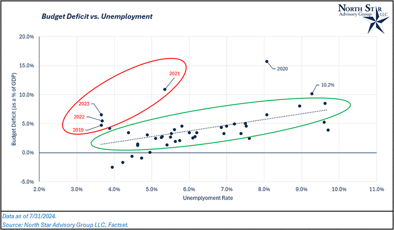
When does this trend become unstable? It likely becomes unsustainable when the interest payments on U.S. debt grow faster than the economy (GDP) for a prolonged period of time. For the past 40 years, U.S. nominal GDP has grown at an annualized rate of ~5%, while net interest outlays for the U.S. have grown at an annualized rate of ~2.7%. Although, from 2019 through the end of 2023, net interest outlays have grown at 18% per year while GDP has grown at 6.2% per year. Last August, Fitch Ratings downgraded U.S. debt from AAA to AA+, citing a potentially “unstable path” of fiscal spending.
Should we be concerned and what does it mean for financial markets? We don’t think there is currently a need for concern, but we do need to acknowledge the fact that the U.S. economy is not forecasted to continue growing at 6.2% as it has in the last 4 years, so a more responsible budget will likely be needed. This means a less stimulative federal government. Additionally, pressure from foreign investors could be put on the U.S. government to follow a more reasonable budget in the form of selling U.S. treasury bonds. If this were to happen, you’d likely see an uptick in interest rate levels and a depreciation of the U.S. dollar.
What is recent employment data signaling?
In June, we saw the unemployment rate move up to 4.1%. While 4.1% is low relative to history (bottom quartile ranking in the last 60 years), we want to focus our attention and analysis on the direction of employment. Where is unemployment trending and what have similar trends produced in the past? As mentioned, 4.1% is relatively low, but the change in the unemployment rate versus the low point in 2023 is somewhat fast. To compare this recent increase to historical periods, we are going to do use a measure that is known as the Sahm Rule.
This metric was developed by Claudia Sahm, a former long-time economist for the Federal Reserve. The Sahm rule is a simple calculation, it takes the 3-month average unemployment rate and subtracts the 12-month low point of the unemployment rate. If this metric crosses above 0.5%, it has historically signaled a recession with a high rate of accuracy (The exception to this rule was in 1987).
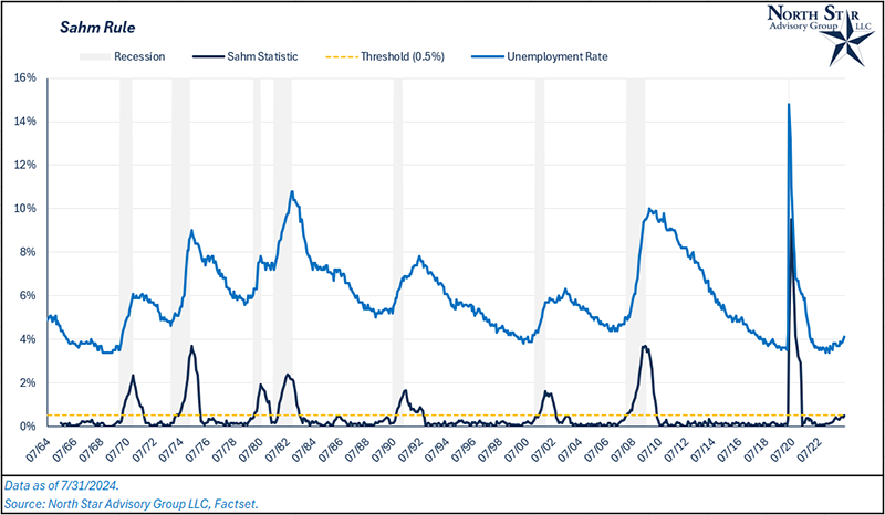
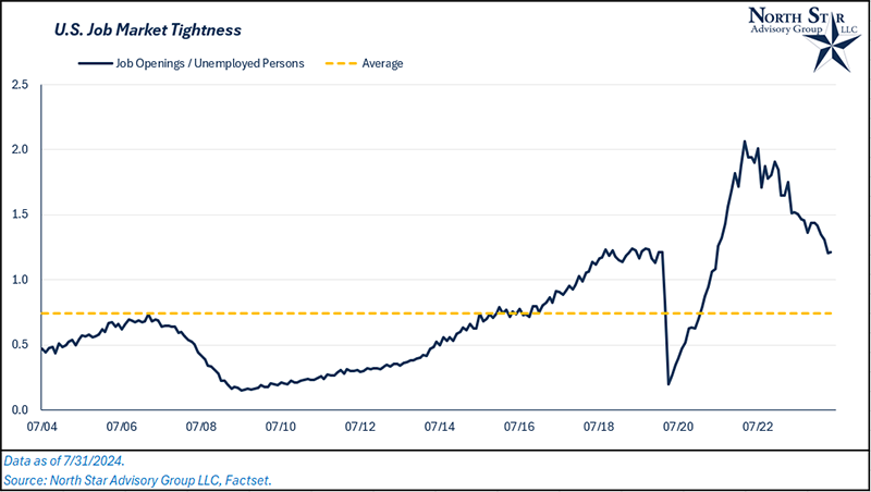
The economic theory behind this rule is a “snowball” effect. As the job market tightens and some people lose jobs, they tend to tighten their budgets and spend less, which leads to more unemployment that grows rapidly. Does this mean that we are inevitably heading for a recession? Not necessarily. Over the last two and a half years, we’ve seen many indicators that have been historical predictors of recessions become “broken.” The best example of this has been the inverted yield curve. Half-way through 2022, we saw the yield curve invert (measured by the 3-month and 10-year treasury rates). Historically, a recession has followed around 12 months post inversion, yet here we are two years later with equity markets near all-time highs and still a low rate of unemployment. This movement over the last year could simply be a normalization of the job market in a post-Covid world. Looking at the ratio of unemployed persons to job openings, there are still a large number of job openings relative to historical averages and about in-line with pre-Covid levels (2018 and 2019).
NSAG News
Please join us in extending a warm welcome back to Lisa Saia! She and her husband, Sal, have had a wonderful summer bonding with their new baby boy Santo. Lisa returns the week of August 6 and is looking forward to reconnecting with our clients.
Our intern Nick’s last day for summer was July 31. We are happy to announce we have extended an offer for Nick to join NSAG as a paraplanner after his graduation from BGSU next May. He’s accepted and we’re all looking forward to his return.
Where will the stock market go next?
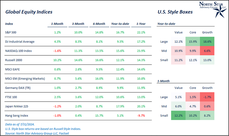
The month of July proved to be a volatile month for stock markets. As discussed in June, North Star expected there to be a broadening of market participation, and right on queue, equity markets experienced a major breadth surge in July (discussed in the first section). Investors rotated out of most mega-cap technology names in favor of small cap, mid cap, and value stocks.
During the month, the S&P 500 was up 1.2%, the Nasdaq 100 was down 1.6%, and the Dow Jones Industrial Average was up 4.5%.
Most notably, the Russell 2000 (U.S. small cap) was up 10% in the month. The catalyst for the rally in small cap stocks started on July 10th when Fed Chair Jerome Powell began to talk more dovish and warned against the economic implications of holding rates high for too long. On the following day, CPI inflation data came in lower than expected. This sent treasury yields lower and small caps higher as smaller companies are more reliant on debt financing, where the majority of borrowing is done at variable interest rates. We are expecting the rally in small cap and value stocks to have legs.
In the commodity markets, both oil (WTI Crude) and natural gas spot prices fell 5% and 20%, respectively. These commodities were positive to start the month of July, but prices fell sharply following the attempted assassination of former President Donald Trump. As we know, a republican White House will be less friendly to green-energy initiatives and more friendly to domestic fossil fuel production. Commodity markets are primarily driven by supply/demand dynamics, and in response to Trump’s increased winning odds (increased odds of higher fossil fuel supply), prices came down.
We are passionately devoted to our clients' families and portfolios. Contact us if you know somebody who would benefit from discovering the North Star difference, or if you just need a few minutes to talk. As a small business, our staff appreciates your continued trust and support.
Please continue to send in your questions and see if yours get featured in next month’s Timely Topics.
Best regards,


Mark Kangas, CFP®
CEO, Investment Advisor Representative