

Each month we ask clients to spend a few minutes reading through our newsletter with the goal of raising their investor IQ. We have officially passed the halfway point of the year and summer is in full swing. For July, we look at concentrated stock markets and the easing of inflation on BBQ prices.
- Beware of a narrow market
- Market cap weighting versus equal weighting
- Summer auto sales
- 4th of July BBQ
- NSAG News
- Where will the stock market go next?
Beware of a narrow market
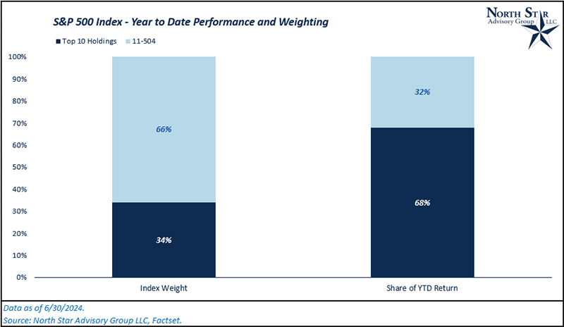
As investors continue piling into the “Magnificent 7” stocks to chase returns, we are seeing an increasingly concentrated market at the top. As of the end of June, the top 10 stocks in the S&P 500 represented 34% of the dollar allocation of the entire index, while those same 10 names accounted for approximately 68% of the index’s year-to-date total return (15.3%).
There are various factors that lead to concentrated markets. Historically, bull markets have had narrow leadership as new technological advancements or industries emerged. As these economic shifts occur, stocks directly involved in the new technologies experience high earnings growth and high rates of return relative to the market as the new industry becomes mainstream within an economy. The momentum effect that comes from continued investment and “return-chasing” tends to push these stocks past their long-term fair values and creates even more concentrated markets. Financial markets are forward looking, and because of that, it is important to invest where the market is going, not where it has been. To do this, we need to gain an understanding of history and past market cycles that were similar to today’s.
The 1920s were dominated by radio stocks, the 1950s by autos, the late 60s and early 70s by the blue-chip companies which coined the name “Nifty-Fifty.” The 1980s were dominated by innovations in the financial sector and computers, the 1990s by the internet, and the 2010s were dominated by SaaS/Cloud technology. Not every period mentioned exhibited extremely high levels of concentration. But the periods that did have concentration were all followed by increased market breadth.
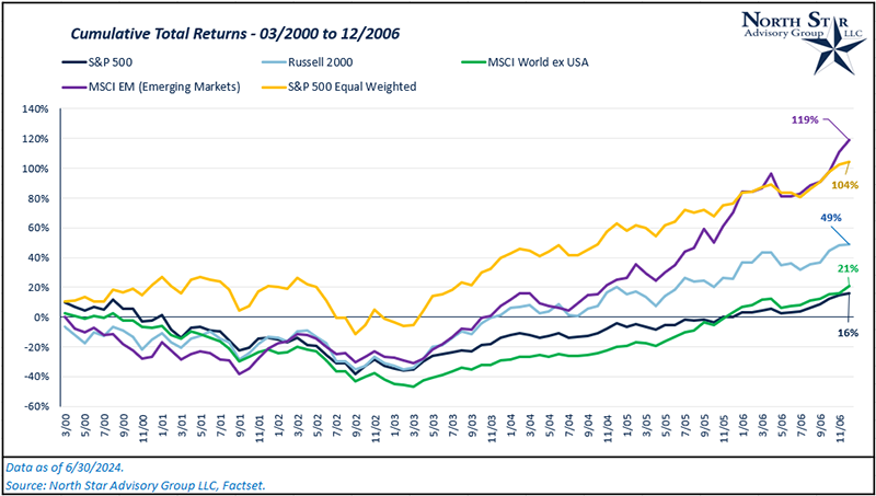
The last period with similar levels of concentration to today was the final innings of the 90’s dot.com bubble. In the chart below, note the top 10 holdings in the S&P 500 peaked at a 28% weight in Q1 2000. Post dot.com bubble and pre-Global Financial Crisis both small cap stocks (Russell 2000), international stocks (MSCI World ex US), emerging markets stocks (MSCI EM), and the equal weighted S&P 500 index all outperformed the S&P 500 market cap weighted index.
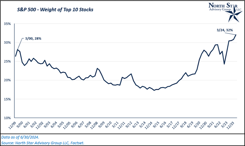
Although we are seeing similar levels of concentration for the S&P 500 today, there are also differences that favor today’s market. The biggest differentiating factors are earnings growth and valuation levels. On 3/31/2000, the top 10 holdings in the S&P 500 had an average NTM P/E ratio of ~51x. Today, the average NTM P/E ratio is ~31x for the indexes top 10 names. While 31x is still higher than most other markets currently, it is significantly lower than 51x. One year ago, the top 10 names had an average NTM P/E of ~33x. Despite strong stock price performance in the last year, valuation levels have slightly come down due to strong earnings growth within those same 10 names.
While we are at historical levels of concentration, which brings elevated risk moving forward, market prices are much healthier in comparison to the last period of major overconcentration (dot.com bubble).
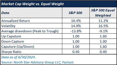
Market cap weighting versus equal weighting
Building on the topic of overconcentrated markets, examining the differences between the S&P 500 Market Cap Weighted Index and the S&P 500 Equal Weighted Index gives us better insight on what properly diversifying an investment portfolio does for both risk and return over long-term investment horizons.
First, let’s quickly discuss the differences in how each index is constructed. A market cap weighted index weights each constituent based on its relative market cap compared to the cumulative market cap of all index constituents. To give an example, let’s say an index had 500 constituents whose combined market caps equated to $1 trillion. If one of the constituent’s market cap is $50 billion, it would get a 5% weight within that index ($50 billion / $1 trillion). An equal weighted index is self-explanatory. Each of those 500 stocks gets a 0.20% weight in the index (1/500).
So, which weighting method has performed better historically? We’ll compare both absolute and risk adjusted returns for both the S&P 500 Market Cap Weighted Index “MCW” and the S&P 500 Equal Weighted Index “EQW” since 6/30/1990 (The equal weighted index’s inception).
Since inception, the EQW returned 11.2% on an annualized basis, while the MCW returned 10.4% on an annualized basis. Over this same time frame, the EQW had more volatility (16.5% standard deviation versus 14.9%). Economically, this is to be expected. When all constituents are weighted equally, regardless of company size, the smaller stocks that are more volatile have just as much influence on the index as the largest stocks in the market do. Despite higher volatility, does the EQW’s higher diversification protect better against drawdowns? Measuring peak to trough drawdowns monthly, the average drawdown for EQW was -9.1%, while MCW was -13.8%. Drawdowns tend to happen faster in MCW as they are less diversified and have larger levels of concentration at the top of the index relative to EQW. The biggest driver of EQW’s lower average drawdown is the fact that this strategy typically captures more upside over various market cycles. This can be seen in the up-capture ratio of ~1.6.
Over this time period, adding diversification away from market cap weighted indices has proven to be the stronger choice when investing over various market cycles from both an absolute and risk-adjusted return perspective.
Summer auto sales
If we rewind our memory to the onset of COVID, clients will remember that there was a large price gap between new and used auto prices. As supply chains tightened in 2021 and 2022, decreases in new auto inventory led to elevated demand for used cars. This chain reaction quickly shrunk the price gap between new and used.
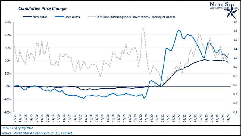
As supply chains have continued easing through 2023, what does the current state of the auto market look like? Looking at the chart below, we’ll examine the cumulative price change for new and used cars over the past 10 years. As you can see, used car prices were slowly falling from 2014 to 2020. In 2021, prices hit a pivot point which coincided with supply chain shocks as well as the inflationary impact from an ultra-easy COVID monetary policy. Both new and used car prices jumped, but used cars rose much sharper in comparison.
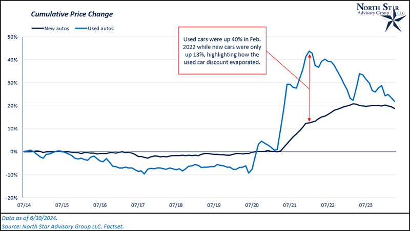
Considering the money supply (non-bank held currencies, checking/savings deposits, and money market deposits) increased by 41% as the Federal Reserve and the U.S. government stimulated the economy during COVID, we’re not surprised to see the general level of prices for both new and used cars increase as the overall economy experienced record inflation. The difference in used car versus new car was the anomaly that was caused by the supply demand kink in our economy. In the next chart, we’ve overlayed the ISM inventory index and ISM backlog of orders index with our original chart. From April 2020 to April 2021, manufacturing inventories fell while the backlog of orders rose. Subsequently, the price change gap ballooned. Prices have now started to converge as used car prices are falling rapidly compared to new car prices. This occurred following a normalization of inventory levels.
Have price drops over the past two years had any impact on demand? As of May 2024, unit auto sales are running at an annual rate of 3.1 million per year, compared to 2.8 million in June of 2022, a 300,000-unit increase.
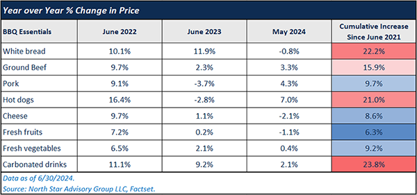
4th of July BBQ
Over the last few years, Timely Topics has had a tradition of giving clients an update on the cost of a typical 4th of July BBQ. Looking at the last three years, white bread (including buns), hot dogs, ground beef, and carbonated drinks have been the biggest pain points for your typical BBQ. Prices have increased 22%, 16%, 21%, and 24%, respectively. Fresh fruits and vegetables have been on the lower end of the spectrum for price increases.
Comparing the year over year change in prices for 2023 and 2024, we are seeing disinflation on average in comparison to 2022 (prices increasing at a slower rate). We’ve even had a few essentials show deflation in the month of May compared to a year ago (white bread, cheese, and fresh fruit). Even the highest inflationary area of an essential BBQ (carbonated drinks) has been in line with overall cumulative inflation since 2021, which has been 22.4%.
NSAG News
Congratulations to Rachel and our summer intern, Nick, on passing their Financial Paraplanner Qualified Professional (FPQP™) exams. The content in this course covers the basics of financial planning, retirement planning, insurance, estate planning, and many other broad areas.
For both Rachel and Nick, this is their first step toward multiple certifications with North Star. Next, they will each begin working on their Series 65 license. The Series 65 license, known as the Uniform Investment Adviser Law Examination, qualifies individuals to provide investing and general financial advice to clients. Passing the Series 65 exam qualifies individuals as Investment Advisor Representatives (IARs).
Where will the stock market go next?
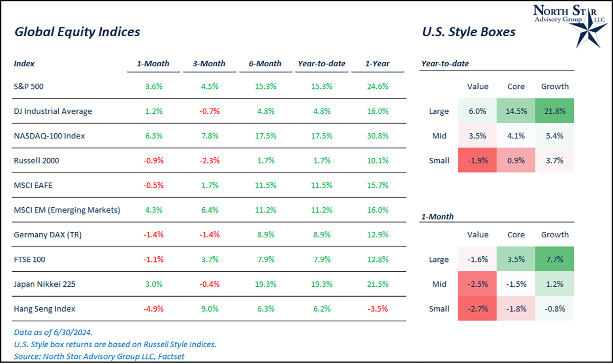
This June, the equity markets followed their historical seasonal average. Typically, June has been a positive month for equities. In the U.S., the S&P 500 was up 3.6%, the Dow Jones Industrial Average was up 1.2%, the Nasdaq 100 was up 6.3%, and the Russell 2000 was down 0.9%. Larger losses in technology (Nasdaq) occurred within the first half of the month caused primarily by underperformance in Nvidia, which saw a drawdown due to investors making profits in the last two weeks of the month. Although, this movement proved to be normal market volatility as the Nasdaq reversed course and finished the month as the strongest major index.
NSAG continues to caution clients about the growing concentration within the top constituents of the S&P 500. The top 10 names currently represent ~32% of the entire index. As discussed in the first two sections of this month’s article, these high levels of concentration have historically led to lower-than-average returns on a forward-looking basis. We continue to recommend diversification into other segments of the market for client’s equity portfolios, such as international, small cap and value stocks.
Elsewhere in the world, international stocks (MSCI EAFE Index) were down 0.5%, while emerging markets (MSCI EM Index) rallied 4.3%.
On June 12, we had a rare occurrence where both the CPI report and the FOMC meeting fell on the same day. Year-over-year CPI came in at 3.3%, which was lower than expectations of 3.4%. Additionally, the Federal Reserve began talking more about cutting interest rates versus holding or raising rates. Both factors led to a rally in stocks on the day, particularly in technology stocks. On June 12, the U.S. 10-year yield fell from ~4.40% to ~4.24%. As we know, interest rates are very sensitive to economic expectations, and we saw strong economic data points in the final week of the month, bringing the 10-year yield back to ~4.40% as of 6/30/2024. As of the end of June, the market (based on federal funds futures prices) is expecting the first 25 basis point rate cut in September.
We are passionately devoted to our clients' families and portfolios. Contact us if you know somebody who would benefit from discovering the North Star difference, or if you just need a few minutes to talk. As a small business, our staff appreciates your continued trust and support.
Please continue to send in your questions and see if yours get featured in next month’s Timely Topics.
Best regards,


Mark Kangas, CFP®
CEO, Investment Advisor Representative